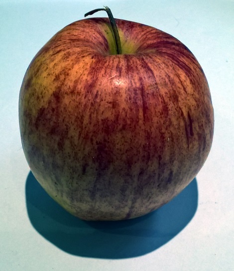
With this week's drawing session fresh in my mind, and our focus on tone, I felt like continuing in a similar vein tonight. This meant looking round for an interesting item to study and I spent quite a while picking up, and discarding, things like jars, bottles and similar objects before settling on this apple. In one sense I choose this because fruit feels like a classic still-life subject and also because it seemed intrinsically interesting:

So I roughly sketched out the shape of the apple, the position of interesting features and where the shadow needed to sit. Then, though, I hit a bit of a snag in that I was finding it hard to see the variation in tone with the naked eye - it was just too subtle (or maybe I just haven't studied enough apples). To get round this I decided to follow the striations of the skin and started drawing line after line to fill out the contours and the look of the fruit; this worked well in that I could overlap lines where the colour was darkest and space them out where it wasn't. With this structure in place it was just a matter of shaping the tone and adding more specific detail with charcoal:

As a stand-alone picture I really like the end-result here - especially when viewed from a distance - as it's a pretty accurate rendering. The shadow certainly helps anchor the drawing and there's a sense of volume to the body. However the limits of drawing in monochrome are rather apparent as for a long time I couldn't work out what to do with the bottom half of the apple - but now, with the photo, I realise that what I'm really seeing is light reflected from the paper which desaturates the colours underneath (rather than it just being in shadow). I don't really know how to represent this in pencil alone though - maybe with some sort of whitener?