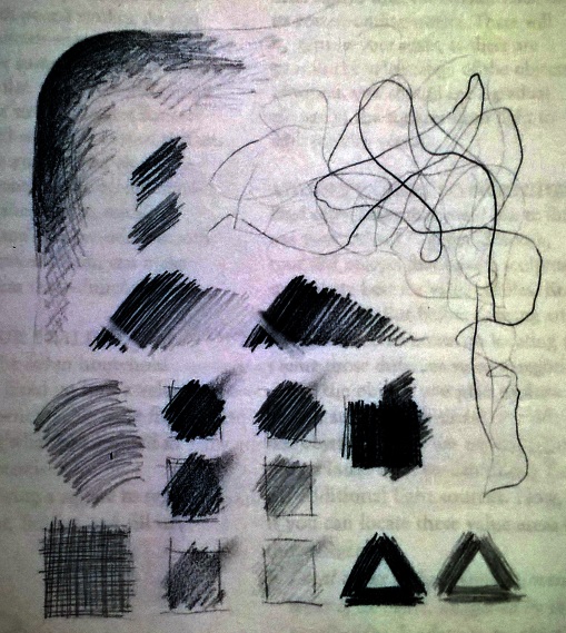
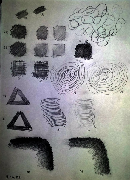
With Drawing for the Absolute and Utter Beginner I've decided to move onto Chapter 4 - Pencil Values. This is all about adding depth, weight and substance to my drawings which means inserting gray tones into my simple line sketches. While I've been doing some of this already I've been working very intuitively and now my gut is telling me that I need some formal guidance! Fortunately Claire Watson Garcia is right here to help and that means, firstly, getting to grips with the tones available from 2B and 2H pencils:

In this exercise the aim is to experiment with the pencils and discover what sort of tone is available through variation in pressure, line direction and smudging effects. I'd thought that I had a reasonable grasp of this but it turns out that pencil lines interact in different ways and can be used to bring out highlights as well as add depth. So I let myself go and, surprisingly, it took longer to complete this sampler than I'd expected - I guess that adding weight to a picture is just as consuming as outlining the contours:

What I find interesting about this experiment is that the 2H and 2B pencils aren't dramatically different - at least in my hands. The harder pencil is clearly lighter but, more than that, its output is somehow less grainy. Meanwhile the softer pencil is much better at contrasting with highlights and allows for a greater range in tone from deep black to light gray. An interesting experience.