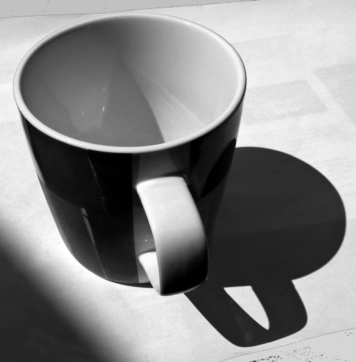
I've grown to realise lately just how much accurate shading and shadows add to a drawing. If you get them right then the whole thing appears so much more realistic and convincing. So I'm trying to focus slightly more on this aspect of my drawings and less on the contours. To make life easier I decided to use a nice symmetrical object with clearly defined lines today - this simple mug:

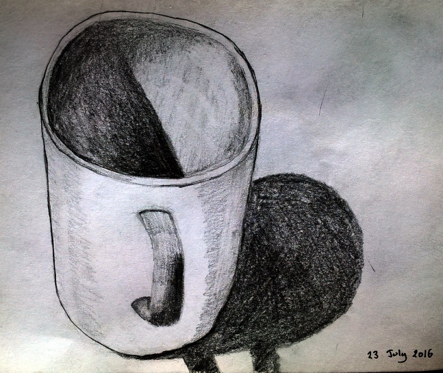
In principle this should be relatively easy to draw given that it's just an ellipse, a narrowing cylinder and some detail around the handle. In practice I thought that I was doing reasonably well and yet that turns out not to be the case:

What is positive though is that the diameter and perspective of the opening is reasonably similar (which is a decent improvement from earlier efforts) while the size of the mug and its base are also moderately proportionate. However the handle is far too skinny (and that's after I already tried to make it wider to compensate) which throws off the picture. Looking at the shadow though I think it's pretty good being as it's in the right position and has the right size; that's good. Still looking at the photo now it's amazing just how subtle the variation in shade across the inside of the mug appears - my effort is far too blunt unfortunately.