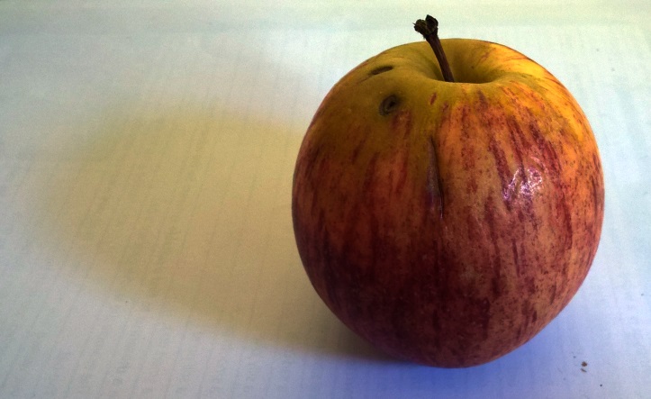
There's no doubt that fruit and vegetables make excellent study objects; the range of tone, varying surface texture and pleasing shape creates an attractive whole. I wonder if this is an evolutionary response designed to guide towards things worth eating? Possible not given that flowers have many of the same qualities and yet aren't great for lunch! Anyway I had this very tasty apple just lying around:

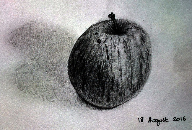
So here I did my best to stick to tonal changes and shadows in generating a sense of mass to the apple (while playing down any outlines and contours). As a process this led me to steadily build up a depth of shading in the darker areas with softer pencils while taking care to keep other elements, such as the vertical stripes of dark red, quite sharp and distinct:

On the whole I'm happy with the result with there being a decent contrast between the two sides of the apple with the bottom being slightly lighter (due to reflected light) and cast shadow being present but not dominant. I also experimented with highlighting areas, by lightly using a rubber, and easing out the edge on the lit side - both of which work well I think. So a reasonably successful picture given how there's no colour to it!