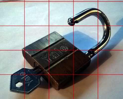
In yesterday's post I talked about using a grid to help me put together a decent sketch of this padlock. Well today I decided to take this contour drawing and make it more real with a decent amount of shading and some cast shadow. In effect I wanted to remove the effect of my freehand drawing from the equation when starting with something like this:
From here I began with the common technique of shading in a base level across the whole object while making sure to avoid the obvious highlights; this left me with the body completely covered but also a little flat. Then I deepened the shading on the right-hand side and the edges to add depth while looking more closely at the letters to see how they caught the light (from a single source). After this the key felt like a good place to employ lighter shading with sharper, deeper lines where shadows became more intense; unlike the shackle where the key element is the reflected light:
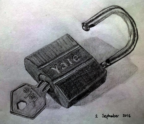
Overall I rather like the striated shading of the padlock body; it suits the material and its density. The bright shackle also comes out nicely both in terms of its shiny nature and orientation; I just wish that its width was consistent over the whole of its length. The most annoying area, for me, is the key as its sizing isn't quite right and it looks almost as if it's been bent in the lock. Still it's not bad, and is clearly made of another different material, and the overall picture works well enough.