Just over 2½ years ago I attended the Mello investment conference up in Derby; a whirlwind of inspiring lectures, company presentations and face-to-face meetings with management. At the time a number of companies caught my eye, many of which I labelled as being just a little too expensive to invest in, while a few felt like good ideas more suited to private ownership.
A few weeks ago I unearthed the conference brochure with original Stockopedia figures for all 36 companies. About the right size for a diversified portfolio and, more usefully, a great opportunity to see if these at the time figures correlated in any way with future performance. The key question then that I want to address is whether we could have used any piece of data at the time to help us separate the winners and losers. After all this is at the core of what we, as investors, try to do with tools such as Stockopedia.
Obviously this isn't a statistically rigorous analysis, with so few data points, but that's never stopped anyone before. I've tried to keep the statistics to a minimum by fitting only a simple linear regression model (i.e. a straight line) to the data and calculating how closely the points fit this line. In broad terms a higher value of R2 implies a stronger correlation with performance in the graphs that follow.
Oh and it's worth remembering that the last 2½ years are just a slice of the current bull market and hardly representative of any other market condition (such as a proper bear market). So on the basis that all of my analysis might be bunk let's move onto the numbers.
Value Rank
Value investing has a long and glorious history and I started out as very much the value investor; unwilling to pay a high price for shares and concerned with identifying overlooked value. So has value paid off?
![]()
While there is no direct correlation between Value Rank and performance I've highlighted the two areas which seem most interesting. In the top half of the ranks, where only a quarter of the companies sat, there are almost no losing shares and the drawdowns are small. At the other end of the scale there are plenty of losing shares but also a significant number of big winners (returning >50%). It's as if the Value Rank helps protect your portfolio from losses but at the expense of reducing your exposure to out-performance.
Momentum Rank
In the current bull market it does feel like momentum is king as numerous shares seem to double and then double again. Would this have helped identify winners?
![]()
Well this is one of the weakest correlations with share price strength up to November 2014 proving unable to suggest any sort of trend continuation. I'm quite surprised by this result but I wouldn't like to draw any conclusion from this data.
Quality Rank
Quality of earnings is a hot topic at the moment and I increasingly find myself choosing quality over value when making investment choices. Partly this is down to my realisation that quality in all forms (management, economic niche, return on capital) translates into long-term success but also I have a soft-spot for companies that do things well.
![]()
This is the best correlation so far with big winners scoring high on quality while the bulk of losing shares scored low. There are winners and losers at all ranks, with lots of scatter, but low Quality Rank does feel like an impediment to success.
Stock Rank
Now you'd think that the overall Stock Rank, a blend of the other rankings, would be the most discriminatory measure of all. I tend to use the Stock Rank as a shorthand for picking "good" shares and so I'd like to see some correlation with performance.
![]()
Well a low Stock Rank does tend to imply poor performance; any shares with a rank in the lower third of the portfolio struggled in recent years. However a high initial rank doesn't correlate with return with the big winners starting in, roughly, the 40-70 Stock Rank range.
ADVFN Posts
On a lighter note we all "know" that a very busy bulletin board is often a warning sign of ramping and de-ramping while a quiet board makes us feel part of a special club. Now ADVFN has possibly the widest range of active boards in the UK - certainly the wildest - so does this common knowledge stack up?
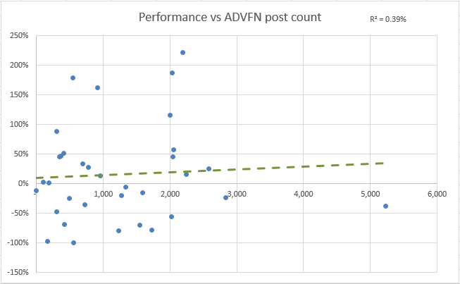
Okay I guess that the answer is a resounding "no". It doesn't seem to matter whether a share has 20 or 2,000 posts to its name, which is reassuring, although it would be great if there was a correlation here to exploit!
Dividend Yield
More sensibly again we all “know” that paying out a dividend suggests that a company is generating real cash and this forces some rigour on the directors. Sadly less than half of the Mello companies paid a dividend back in 2014, at an average yield of just under 2%, but there's no point stopping now.
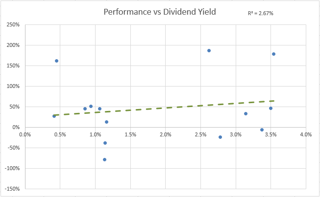
It turns out that any level of dividend does tend to filter out the dross and leave you with shares that are going to do ok at the very least. I don't think that the absolute value of the dividend matters - it's enough to be financially strong enough to pay one in the first place.
Share Dilution
Another idea, which feels sensible to me, is that companies which keep issuing shares and diluting existing shareholders may not be good investments. So I've taken the share count back in 2014 and calculated a CAGR (compound annual growth rate) for each company based upon the number of shares outstanding today. How does this relate to performance?
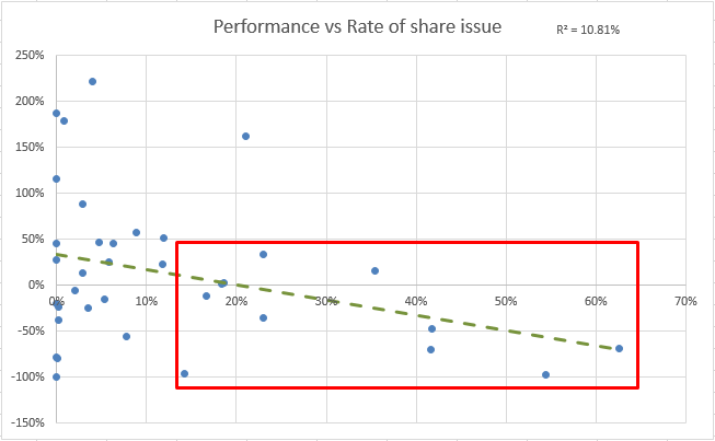
I think that this graph is a story of two halves. There are plenty of shares (the majority, in fact) that have issued anything from zero up to relatively small numbers of shares (<10% CAGR) and performed variably. Then are those companies compounding up their shares at >15% and (apart from outlier Ideagen) there's a strong correlation between dilution and lacklustre performance.
Risk Rating
Recently Stockopedia released the Risk Rating where historic share price volatility is used to classify each share. This wasn't available back in 2014 but I've decided to use the current rankings for each share on the basis that volatility is an enduring characteristic (over 2½ years anyway). Given that Mello didn't feature any of the least volatile shares how does the average return in each of the four remaining buckets look?
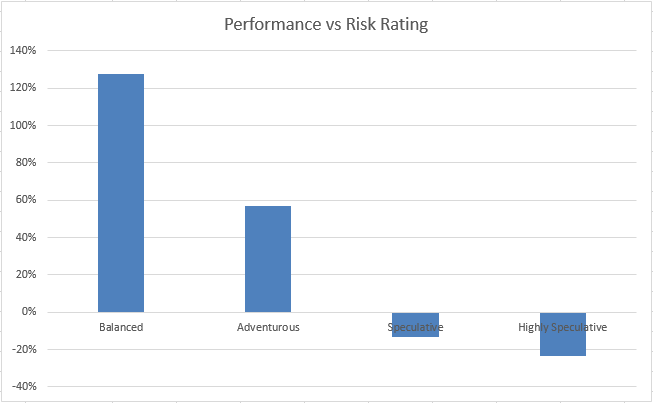
Wow. I am concerned about current risk ratings being driven by performance (and I'd love it if the Stockopedia wizards could tell me the ratings that these shares would of had in late 2014) but if this isn't a factor then the correlation is stunning. On the face of it we'd all be better steering clear of speculative/highly speculative shares altogether.
Conclusion
For all that this a rough and ready piece of analysis I'm quite pleased with the outcome. It's clear that none of the metrics are a silver bullet for guaranteed success (and I checked plenty, such as P/E, ROCE and relative strength, that weren't even interesting enough to include). Instead many of them add value by weeding out the weaker shares and tipping the odds in your favour; here I'm looking at the Quality Rank, some sort of dividend yield and an aversion to issuing new shares.
Most surprising, to me, is just how much the Risk Rating results look faked! I didn't expect such a clear-cut result and I'm wary that using current rating values has biased my results (and the buckets are small with only three shares in the "Balanced" category). Still the result is so striking I find it difficult to believe that it isn't reflective of the underlying danger of high volatility - it damages your wealth.