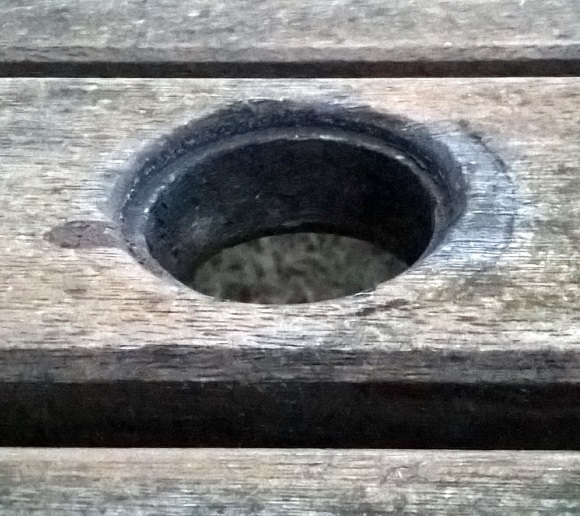
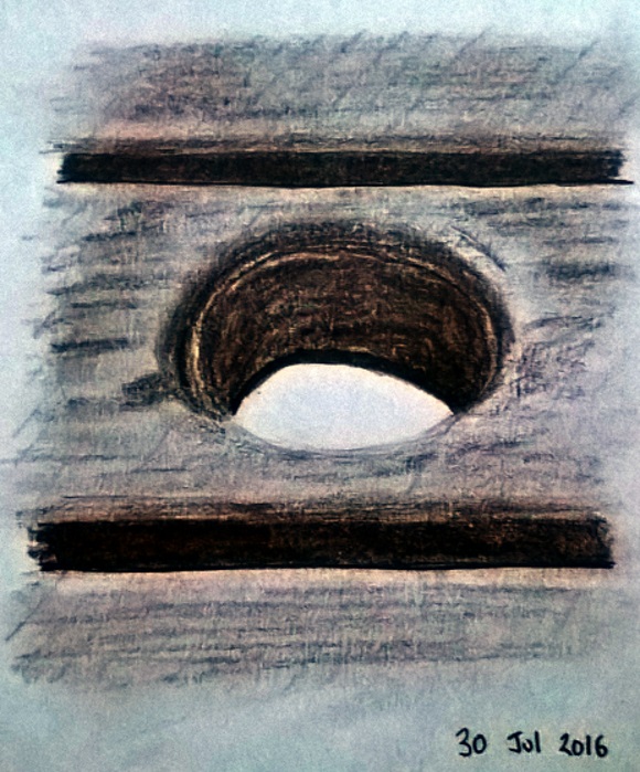
Casting around for inspiration this lunchtime I found myself gazing at the hole in the centre of my picnic table; the grain of the wood was most appealing and I liked the shadow effect in the hole. It's tough to find a decent subject sometimes but as I'm concentrating on shading at the moment this felt like an opportunity worth grasping:

My approach here was to outline the key shapes (such as the obvious central ellipse and horizontal lines) before filling in shading with a neutral tone. After this I moved onto the deeper shades to add depth to the picture and worked on some of the details:

On the whole I'm rather pleased by this simple vignette. Comparing the photo and my picture I can see a real similarity between the two in terms of tone and shape. Maybe sometimes it's worth zooming into a very specific detail when sketching rather than trying to capture a full, majestic scene? I know that when I try to go large I generally end up rushing through the whole picture without capturing any element successfully.