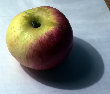
Following on from my tinted sketch yesterday I decided to attempt something a little more organic today. Not for the first time I frisked the fruit bowl and found an apple with excellent contrast between its light and dark sides. You couldn't really ask for a more favourable balance than this:
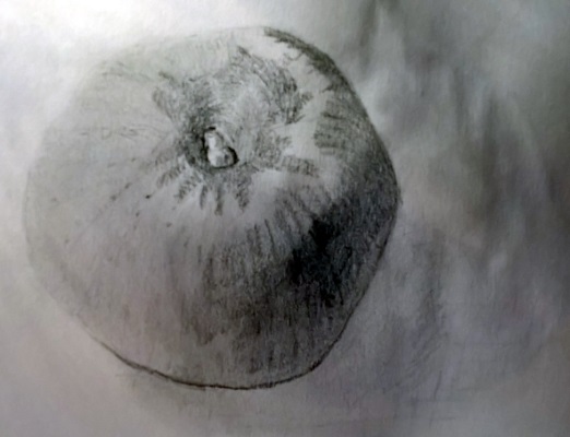
In the traditional manner I worked out an approximate circle for the apple and then flattened out a few edges where the apple deviated from perfection. Then it was just a matter of deciding where to place features, such as the stalk and the darkest areas, before adding some very light shading. It's somehow easier to get the dark areas looking good (maybe there's more room for error?) but I'm happy with the light parts here too:
With the wash, well, once again the whole picture received an initial covering before I focused on the dark side and a few areas around the stalk. Using a wash very much suited the material today with its inherent streakiness and distinct contrast between the green and red sides. The latter probably got at least 4 coats of wash while I worked on the cast shadow a few times to bring it into focus:
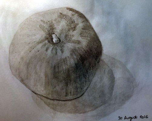
The result here is definitely more successful than yesterday's attempt; probably because the apple skin itself demanded some fairly random patterns. Beyond this lifting the tone of the whole apple with that initial coat also helped to unify the drawing and lift it away from the background paper; there's an advantage to using a wash right there. So I'm a lot happier overall and will try to remain mindful of matching an object to the sketching techniques which are best suited to it.