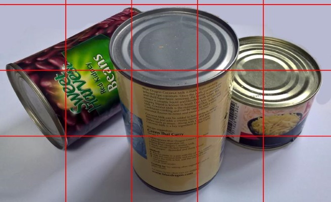
In my study yesterday I placed a regular grid over my picture of some cans to assist me in getting the basic shapes down on paper. This worked out very well and I was able to reproduce this photo with some fidelity:

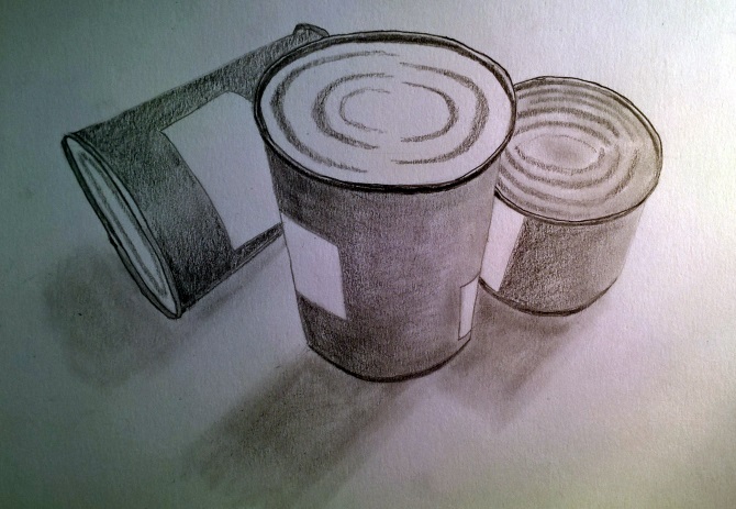
However after spending quite some time adding shading, tone and other softer aspects to my drawings I'm afraid that I find contour drawings to be somewhat bleak. In a way I like their stripped-back, nothing but the bones, feel but I also miss the sense of reality that you can get with shading. So today I worked on adding more body and soul to my contour picture through a greater appreciation of light and dark across the cans - which was a little tricky as the labels tend to suppress highlights. Nevertheless I knew that the main light source sat in the top-right and worked my way from there:

Clearly I've greatly simplified the picture, to avoid a whole lot of fiddly detail, but I think that the cans come across fairly well. I'm especially pleased by the lids and the way in which their lips stand out through leaving a thin annulus of highlight. I also tried a couple of new things today; one was to use a cotton-bud to smooth out the graphite, rather than my finger, which seemed to work well with the shadows while the second involved using an eraser shield when rubbing out so that I could erase right next to a line without destroying the bit that I wanted to keep. This worked extremely well and allowed me to take some of the edges of my cans away to leave a much more realistic, softer edge. Useful techniques for the future I think.